Impresses Your Guests With Say I do
Starting the journey to your wedding day with a beautiful and impressive wedding website can make all the difference in setting the tone for your upcoming celebration. But if the idea of creating one seems daunting because you’re not a tech wizard, don’t worry! Building a wedding website, especially with tools such as Say I do, is simpler and much more straightforward than you might think. In fact, it’s actually one of the more fun aspects of wedding planning, giving you the opportunity to share your love story and exciting wedding details with friends and family in a personal and impactful way.
The following guide is here to walk you through the process of creating a wedding website that looks awesome AND wows your guests from the moment it lands in their inbox. So, whether you’re starting from scratch or looking to tweak an existing design, we’ve got you covered. Let’s dive in…
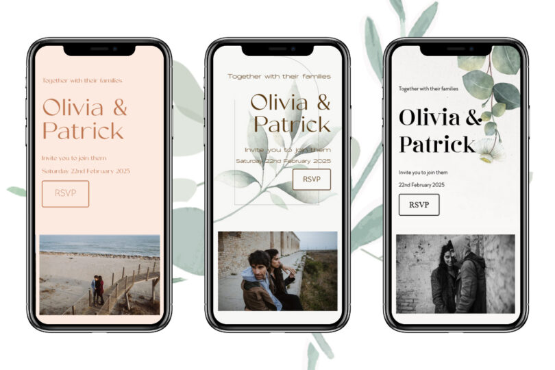
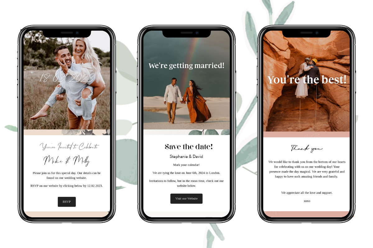
First things first, you need to find a website builder that essentially does all the hard work for you behind the scenes. With MANY website builders to choose from, it can initially feel a little overwhelming; in our opinion, Say I do may be the perfect place to start. All you need to do is choose a template you love and pop in all the important details that are personal to your big day. It really can be as simple as that. With 50+ stunning templates to choose from, you’re spoilt for choice and are bound to find one (or more!) that perfectly reflects your wedding style and theme. From clean contemporary designs to bright boho aesthetics, they’ve literally got something for everyone. Therefore, your wedding website will not only look awesome but also have multiple features that will save you unnecessary stress down the line. A personalised wedding checklist, a built-in RSVP feature, a seating planner, email invitations—the list goes on! Oh, and we should probably mention that it’s free to get started!

OK, so the website builder is locked in; what’s next?
Create your own domain
This part is important because customising your domain has many advantages for you, your partner, and your guests. When you reach this step, don’t forget to create a domain that’s simple and easy to remember; this gives all wedding websites a more polished and professional first impression. Plus, coming up with domain names with your partner can be super fun! But how can you select the ideal one for your wedding website? Here are some pointers to help you along the way.
Keep it snappy: Whether guests are entering the URL of your wedding website on a desktop computer or a smartphone, try to keep it brief to reduce errors. You want to make sure that your wedding website’s URL is both memorable and concise when the time comes to share it.
Be mindful of your spelling: If you attempt to be smart with the spelling of some terms in your domain name, you risk creating more confusion than you anticipated. Aim for the proper spelling, and if a particular word is too long, choose a shorter synonym.
Use first or last names: Using just your first and last names will help make your URL short. However, depending on availability, you may need to test adding a wedding-related word to the URL in addition to your name.
Consider nicknames: If one or both of your names are particularly lengthy or difficult to spell, this can be really helpful. Even if you don’t fit this description, using nicknames to personalise your URL may be a lot of fun and memorable.
Steer clear of numbers, hyphens, and ampersands: Avoid using symbols and numbers that could be misinterpreted or even forgotten to reduce confusion among guests.
The customising stage
Ok, now the really fun bit begins! When choosing a template, think about your wedding theme and the overall look and feel that you want to achieve on the day itself. Your wedding website should reflect this; after all, this is your first chance to set the scene for your guests and give them a taste of what the day may hold for them. So, when it comes to customizing the pages to fit your unique style and needs, consider including your colour scheme plus any bespoke icons and designs, along with personalized photos and videos.
It is recommended that couples don’t rush this stage because while you’ll naturally want it to look great, it’s important to create a wedding website that’s simple and easy to navigate for your guests as well. This ensures that it’s functional and user-friendly, and they can easily find all the important information they need.
Lastly, a perfect wedding website should look great on various devices, including tablets, phones, and desktops, so remember to test it on different browsers to make sure it’s compatible across the board!

Don’t forget to add the important details!
There are a LOT of details and vital information to organise and communicate during the wedding planning process, which is why one great thing about a wedding website is that you can add and tweak things along the way. However, make sure you’ve got all the essential details included before you share your URL. Below, you’ll find the key pieces of information that could be included to keep your wedding party informed ahead of the big day. Don’t worry if they’re not all relevant to your unique wedding plans; feel free to simply use this as a guide.
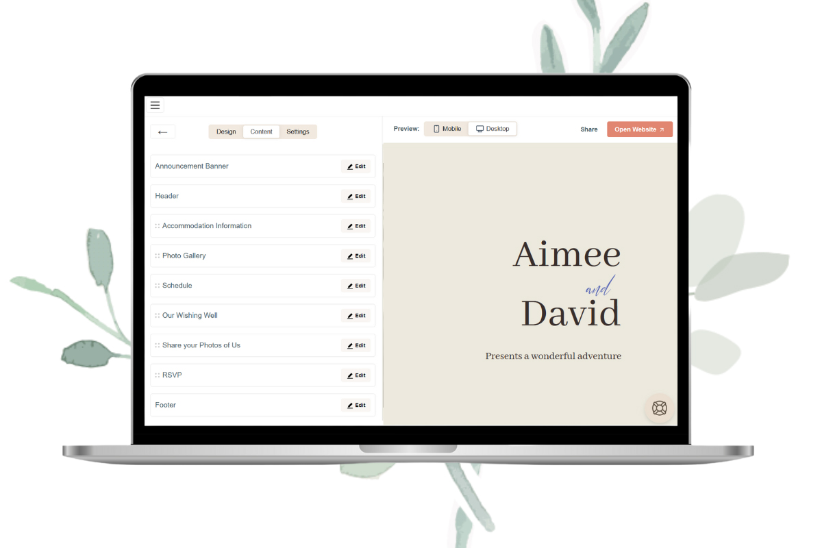
Details about the wedding: The wedding date, time, and venue(s), together with any other events that your guest list is invited to, such as the rehearsal dinner or post-wedding brunch.
Accommodation: At this point, a list of suggested hotels and ways to get around for out-of-town guests would be super helpful.
Your love story: Give a brief account of how you two met, your engagement, and your favourite things to do together. Or share some fun facts about one another that your guests might not already know!
Registry information: Details about your gift registry/wishing well. Your wedding website is the perfect place to store this information rather than on the invites themselves.
Photographs: Include images of you and your partner together with any significant guests, which might include engagement photos and memorable holidays you’ve spent together. Use high-quality photos and videos, but not too many!
An FAQ section: Guests will undoubtedly have questions about the wedding, such as dress code requirements, whether children or plus ones are invited, etc. The website’s FAQ page can answer these sorts of questions, which will prevent you from being bombarded with the same questions leading up to the wedding.
Details of how to get in touch: Share a way for guests to contact you or your wedding planner with any queries ahead of the wedding. This could be via a specific wedding email address you’ve created or a wedding WhatsApp group.
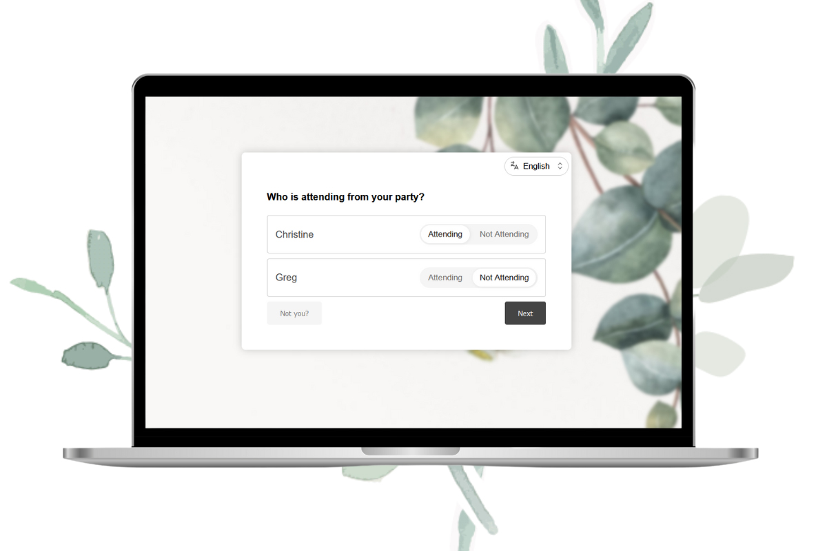
Customize your RSVP questions and tailor them to each guest.
The ‘confirming your attendance’ section on a wedding website is arguably one of the most useful features. Say I do’s user-friendly and super handy digital RSVP feature will save you from having to organise replies from different sources and keep all your RSVPs in one easy-to-access place. We recommend communicating an ideal RSVP deadline date on your wedding invitation so you (hopefully!) won’t have to chase many late responders.
Another feature that our couples love and will come in really handy is the opportunity to customise your RSVPs and ask your guests specific questions or share important details about the wedding via the online RSVP form. The most obvious and vital piece of information you’ll need to gather before the main event is your guests’ meal choices and whether there are any dietary requirements to be aware of. For a bit of fun and to ramp up the excitement before your big day, you could also ask for any song requests to get the party started or some marriage advice for the weeks leading up to the big day!
Keep your guests at the forefront of your mind
Yes, it’s yours and your partner’s day, but ultimately, you’re the host, so it’s really important to keep your guests’ experience at the forefront of your mind when planning your wedding day. This starts with the wedding website. Thinking of all the details at the planning stage will ensure the smooth running of the day itself, ensuring everyone will be more relaxed on the day, eliminating any unwelcome situations that may arise. Here are a few more tips to ensure stress levels are kept to a minimum for everyone involved in helping you create your dream wedding…
Include a section briefly detailing the timeline of events: Some guests like to know exactly what’s going on and when. Communicating a rough outline of the day will help answer questions and help your guests get organized without having to tell them every last detail and ruining the element of surprise!
Use a password to protect your site: Keep your website exclusive and password-protect it so only guests who type in the correct password can access it. Therefore, you should ensure you only share the website and password with those invited to your wedding.
Recommend local activities to prolong your guest experience. Some out-of-town guests may be making a holiday out of your wedding, so why not suggest local things to do so they can make the most of their time away?
One last hot tip before we send you on your way! Send your website to a few key members of your wedding party ahead of pressing ‘send to all’ to ensure you haven’t missed anything or made any silly spelling mistakes. Saying that, the great thing about a wedding website is that you can add, tweak, and change things as much as you like along the way. But most of all, have fun with the process; it’s your chance to get creative, set the tone for the day, and get excited ahead of your impending dream wedding!


